Online Bookstore and Content Library

Role
UX Researcher, UI/UX Designer, Web Developer
Skills
Figma (wireframing/prototyping)
User Research
Web Design and Development
Project Type
Client Project
1. Understanding the problemPhysical only, word of mouth book sales severely limiting the reach of the publisher
Current Situation
No streamlined way to list books or content online
All book orders placed through phone call or text
No digital record of past book orders or customers
Understanding client needs
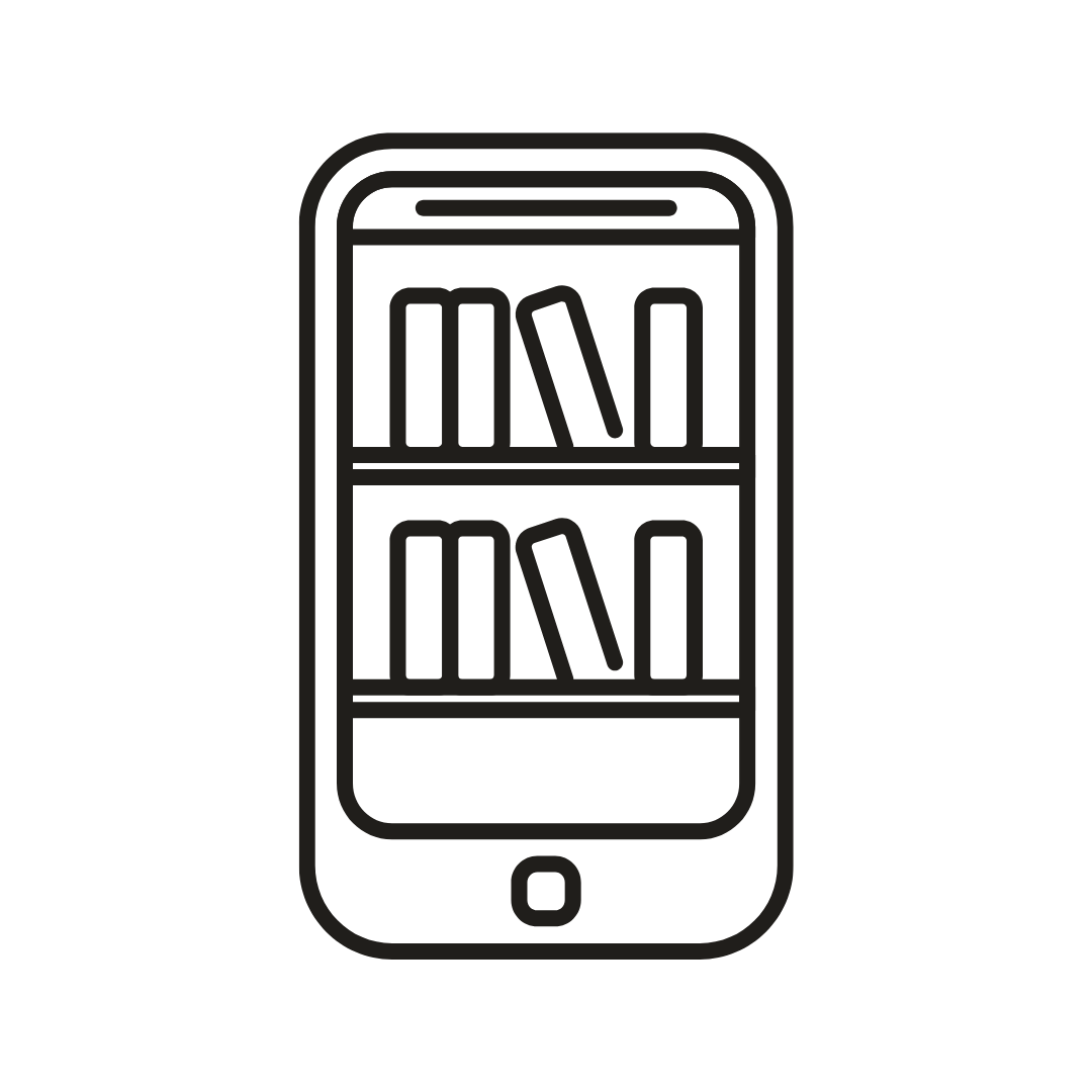
Video Library for customers to view content relevant to the books

Online Bookstore for customers to browse and purchase books
Have a single location to Track and Manage Orders, and get notified when an order is placed
Easily Manage Website Content including adding and updating books, and updating inventory information
2. ProcessUser Research
Interviewed 8 current customers, and gathered the following insights
Customers don’t want to download another app on their phones
Customers prefer a simple, intuitive interface to view and purchase books
Most current customers are middle to older aged, some of them prefer the familiarity and accessibility of ordering through a phone call
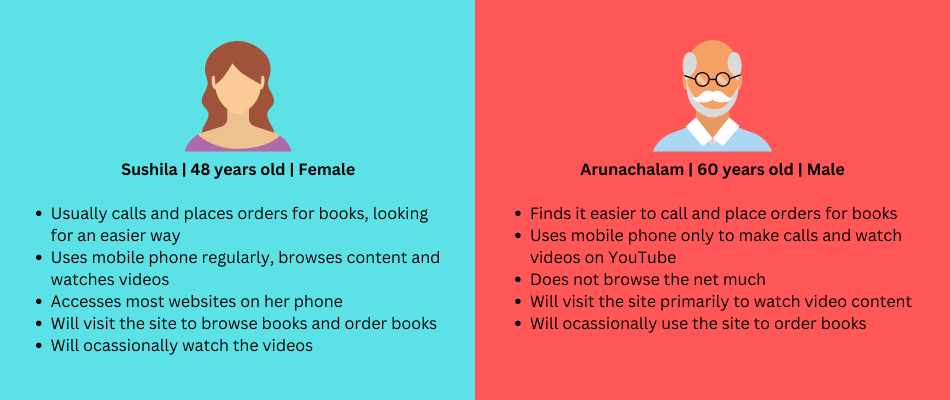
The two personas identified through my user interviews
Wireframes
I used insights from user research to drive the design of the wireframes and prototypes
One of my goals was to make sure the older population have no accessibility issues while interacting with the app.

Initial wireframes for the app - homepage with the videos, a books page, about and contact page
Figma Prototypes using Google’s Material Design System

Home page with clearly laid out buttons showing users all the actions they can take on the website

Videos page displaying a list of videos for users to browse through

Books page displaying a list of purchasable books filterable by category
Design Decisions
Based on our target users and use case, I decided to go with a simple bottom navigation menu rather than the traditional hamburger menu

Advantages for a bottom navigation vs. hamburger menu for our use case
Usability Study
Learnings
To validate and iterate on the prototype, I conducted usability studies with a small group of people, giving them the following tasks to perform on the web app
Navigate to the videos page and browse through the videos
Navigate to the books page and try purchasing a book
Videos Page
On larger screens, video / image takes up the whole page , and is not intuitive to users that they need to scroll down
Not intuitive that users need to click on the book category button to browse books
[On iPad] 2 users found slight difficulty in locating or recognizing the navigation bar at the bottom
Books page
Not intuitive to tap on “view books” button to view the book
Users were instead tapping on the book image or in the general space
Lack of book descriptions meant that customers did not feel as comfortable purchasing a book they did not know about
Some customers felt the book thumbnail image was too small
~75% of interviewees found difficulties on the above items
Iterating on These Learnings
Taking the above learnings into account, I made the following changes
Reducing initial video image to make scrolling more intuitive
Making the navigation options clearer (especially for iPad users)
Linking the book thumbnail image allowing users to click on the thumbnail of any given book to be directed to the book page
Increase the size of the book thumbnail images to make it easier to view on phone screens
3. ReflectionReflecting on the process
When I worked on this project, I did not have any formal education or training in conducting user research. I attempted to step out of my software engineering mindset in an effort to truly understand our users.
My Learnings
Meeting users where they are (within their context) - Through the usability study, I encountered a user opening up the web app on their iPad (in landscape mode). This gave rise to a lot of insight I would not have otherwise uncovered
Being one of my first attempts at establishing a user centered design process, I further understood it's importance in solving a problem or building a product from 0 to 1
Things I would do better
Conduct a more defined and established user interview process
Spend more time in the research phase, before moving on to solutioning
Design a more comprehensive set of wireframes and prototypes in Figma
Focus less on the development side of things - use a platform like shopify to build and iterate faster
Separating “Client” and “Users” - in this case, my client was in many ways my user, but the core users for the product were customers who were looking to purchase the books